01
Designing Below 1280×720
Uploading a 640×360 or 800×450 thumbnail means YouTube has to upscale it. The result: blurry faces, unreadable text, and a thumbnail that screams 'amateur content.' Always design at full 1280×720.
What size should a YouTube thumbnail be? The answer: 1280×720 pixels at a 16:9 aspect ratio. But there's much more to getting it right. Here's everything you need to know.
YouTube's official thumbnail specifications. Minimum width: 640px. Always design at full 1280×720 resolution for maximum sharpness on all devices.


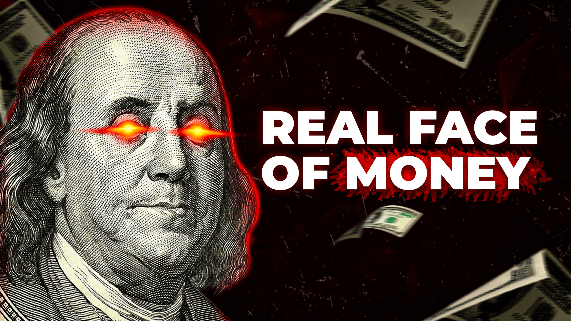





YouTube's official thumbnail size specification hasn't changed since 2013 — and for good reason. Here's the complete breakdown of what size a YouTube thumbnail should be.
The YouTube thumbnail design size is 1280 pixels wide × 720 pixels tall— a standard HD resolution that matches the 16:9 widescreen format used by YouTube's video player. This has been YouTube's official recommendation since custom thumbnails were introduced, and it remains the gold standard in 2025.
While YouTube accepts images with a minimum width of 640 pixels, always design at the full 1280×720 resolution. Here's why: YouTube serves thumbnails at multiple sizes across different devices. On a smart TV or 4K monitor, your thumbnail may render at near-full resolution. If you uploaded a 640×360 image, it gets upscaled and looks pixelated — destroying your first impression and killing your click-through rate.
Pro Tip from ThumbnailMate: Our designers create at 1280×720 in Photoshop using 300 DPI working files. This means every element (face cutouts, text, effects) is created at maximum quality before the final export. The result is a thumbnail that looks razor-sharp on every device — from a 6-inch phone to a 65-inch TV.
Understanding the YouTube thumbnail ratio is critical — get it wrong and YouTube will crop or letterbox your design, cutting off faces and text.
YouTube's native aspect ratio. Your thumbnail fills the entire frame perfectly with no cropping, no black bars, no distortion.
Too square. YouTube adds black bars (letterboxing) on the sides, or crops the top and bottom. Your design loses visual impact.
Square thumbnails get heavy cropping on both sides. You lose nearly half your design canvas. Critical elements get cut off.
The YouTube thumbnail ratio of 16:9means that for every 16 units of width, the image is 9 units tall. In decimal, that's approximately 1.778:1. This widescreen format is the international standard for HD video and is used by YouTube's player on every device.
What happens if you use the wrong ratio?YouTube doesn't stretch your image to fit. Instead, it either crops the image to force a 16:9 fit (losing your edges) or adds black letterbox bars (making your thumbnail look unprofessional). Both outcomes reduce your click-through rate because viewers associate poorly formatted thumbnails with low-quality content.
A quick ratio check: divide your width by your height. If the result is 1.777…(or very close to it), you're at 16:9. For example: 1280 ÷ 720 = 1.778 ✅ | 1920 ÷ 1080 = 1.778 ✅ | 1000 ÷ 800 = 1.25 ❌ (that's 5:4, not 16:9).
You upload at 1280×720, but YouTube renders your thumbnail at different sizes depending on the device and context. Here's exactly how big your thumbnail appears on each platform.
Standard browse grid on 1080p monitors
Sidebar recommendations while watching
Small but critical — 70%+ of YouTube traffic
Full resolution on large screens — quality matters most here
Medium size — text readability is critical
Social media embeds, blogs, and link previews
70%+ of YouTube traffic comes from mobile, where your thumbnail displays at just 168×94 pixels — roughly the size of a postage stamp. This is why bold text, close-up faces, and high-contrast colors aren't optional — they're essential for readability at tiny sizes. Always preview your 1280×720 design at mobile size before uploading.
Getting the pixel dimensions right is only half the battle. File format, compression, and file size all affect how your thumbnail looks after YouTube processes it.
| Format | Best For | Typical Size | Quality | Status |
|---|---|---|---|---|
| JPG / JPEG | Photo-heavy thumbnails with faces and gradients | 80-200 KB | Good — slight compression artifacts | ✅ Recommended |
| PNG | Text-heavy thumbnails, graphics, sharp edges | 200-800 KB | Excellent — lossless compression | ✅ Recommended |
| GIF | Simple graphics (non-animated only) | 100-500 KB | Limited — 256 colors max | ❌ Avoid |
| BMP | Not recommended for web | 1-2.7 MB | Uncompressed — wastes bandwidth | ❌ Avoid |
| WebP | Not supported by YouTube thumbnails | N/A | N/A — not accepted | ❌ Avoid |
YouTube places UI elements over your thumbnail. If you put critical content in these areas, viewers won't see it. Here are the danger zones to avoid.
Video duration timestamp (e.g., '12:34')
Never place key text or faces in the bottom-right 120×60px area
Watch Later / Save to playlist buttons
Avoid placing critical elements in the top-right 80×40px area
Progress bar on partially watched videos
Keep important content at least 30px above the bottom edge
Even experienced creators make these YouTube thumbnail design dimension errors. Each one reduces your click-through rate and costs you views.
Uploading a 640×360 or 800×450 thumbnail means YouTube has to upscale it. The result: blurry faces, unreadable text, and a thumbnail that screams 'amateur content.' Always design at full 1280×720.
Uploading a 1:1 or 4:3 image causes YouTube to crop or letterbox your thumbnail. Faces get cut in half, text disappears off-screen, and black bars make your video look unprofessional in the feed.
Exporting JPG at quality 40-50% to save file size creates ugly compression artifacts — blocky gradients, smeared text, and halo effects around faces. Keep JPG quality at 85%+ for clean results.
Designing only for desktop view (360×202) means your thumbnail may look great in full-screen Photoshop but becomes an unreadable blob on mobile at 168×94. Over 70% of viewers see your thumbnail on mobile first.
Placing text or key imagery in the bottom-right corner where YouTube's timestamp badge overlays. Your '5 KEY TIPS' text becomes '5 KEY 12:34' — confusing and unprofessional.
Exporting in CMYK (print color space) instead of sRGB (screen color space) causes colors to shift dramatically. Your vibrant orange becomes muddy brown, and your blues turn purple. Always export in sRGB.
Now that you know the YouTube thumbnail design size, here's how to use every pixel effectively. These tips come from designing 500+ thumbnails at ThumbnailMate.
Divide your 1280×720 canvas into a 3×3 grid (each cell = 427×240). Place your subject's eyes on the upper third line. Place text along the lower third. This creates natural visual balance that guides the viewer's eye.
At 1280×720, that means the face should occupy roughly 512-768 pixels of width. Crop tight — viewers need to see the emotion in the eyes and mouth, even at mobile thumbnail sizes. Leave the remaining space for text or context.
On a 1280×720 canvas, text smaller than 80 pixels tall becomes unreadable at mobile display sizes. Your headline text should be 100-150px, sub-text 60-80px. Use bold/black font weights only — light and regular weights disappear.
Text without an outline gets lost against busy photo backgrounds. Add a 3-5 pixel stroke (dark color, not black) around all text. This ensures legibility regardless of what's behind it. This is non-negotiable for professional thumbnails.
The outer 10% of your 1280×720 thumbnail (roughly 64px on sides, 36px on top/bottom) is the danger zone for UI overlays and edge cropping. Keep all important elements — faces, text, logos — within the center 1152×648 area.
In Photoshop, design at 100% zoom for pixel-perfect precision. Then zoom out to 25% (or resize preview to 320×180) to simulate how your thumbnail looks in the YouTube browse feed. If the composition doesn't read clearly at 25%, simplify it.
Some thumbnails look better as JPG (photo-heavy with gradients), others as PNG (text-heavy with sharp edges). Export both, compare file size and quality, then upload the better one. ThumbnailMate tests both formats for every thumbnail we deliver.
Every thumbnail below was designed at the correct 1280×720 pixel YouTube thumbnail size using custom Photoshop compositing. Hover to see the niche category.

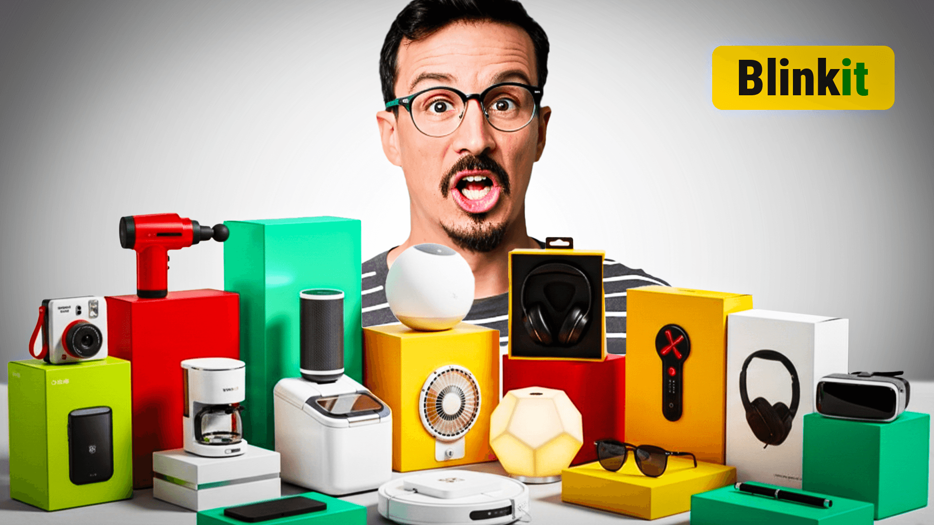


Every ThumbnailMate design is created at the perfect 1280×720 YouTube thumbnail size, exported in the optimal format, and tested at mobile preview size before delivery. No sizing errors. No blurry uploads. Just click-worthy thumbnails.
No commitment. No credit card. See what professional thumbnails at the correct 1280×720 size look like — designed for your channel.
Get 3 Free ThumbnailsTrusted by channels with 3.6M+ subscribers